Some Examples of Web Accessibility
Highlighting hyper-links for greater focus
examplehyper-link.com
This hyper-link is an example of using link highlighting to show that the link is being selected. This particular link has been set so that it will normally be blue, change green when the mouse hovers over it and orange when it is otherwise selected.
Use colour and size
Careful colour selection is another important part of Web accessibility, as even small changes in colour or shade can greatly effect the ease with which a page can be read.
It’s not always best to have the greatest possible contrast. Sometimes it is more effective to use light and dark grey as opposed to using black and white.
In addition the efficient use of Bold text or italics as well as Colour can be effective tools to make a site more easily used.
Making Images Accessible
-
 This image is a content image - meaning the image itself is important to the information of the site, and as such the alternate text for the image must describe what the image shows.
-
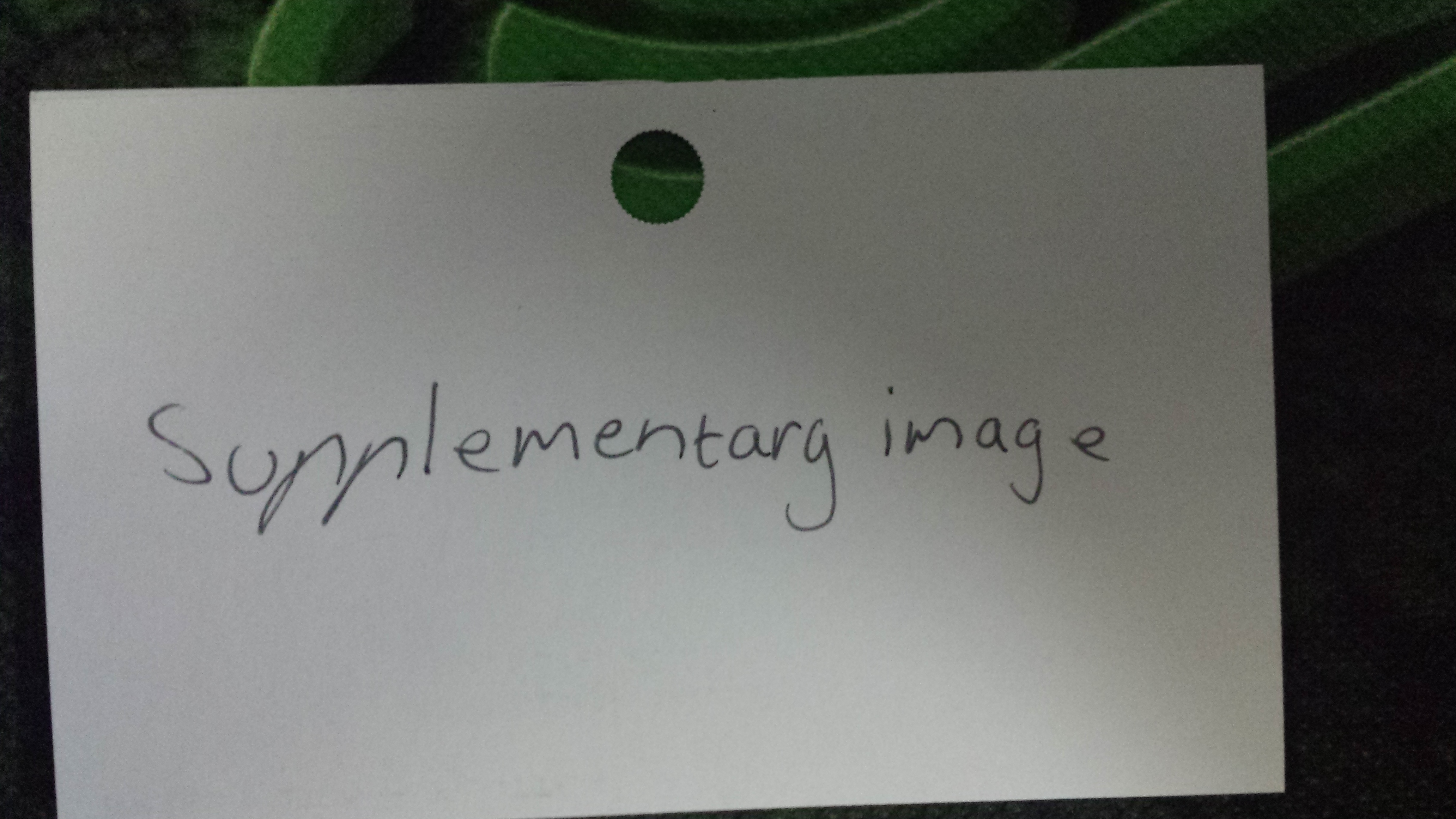 This image is a supplementary image - meaning that it is there, not as part of the information, but alongside it. As such the alternative text should be a description of the image itself, not what is in the image.
-
 This image is a decorative image - meaning that it does not actually contribute any information and is only there for decoration. Its alternative text should be set to null.
Descriptive Hyperlinks
All hyper-links should clearly identify where users will be re-directed to in the text of the hyper-link. An example of a good hyper-link that leads to the homepage would be:
Go to HomePage
And an example of a bad one:
Click Here!
Tables and Accessibility
Tables should have either a caption or a summary depending on what they contain. Tables should also clearly identify the data held as either a header or table data.
Basic information about a group of people.
| Name |
Age |
Favourite Colour |
| Brunhilde |
1700 |
Gold |
| Euryale |
3500 |
Purple |
| BlackWing |
34 |
Purple, Silver, Black |